Flint Street Food

We developed a promo site for the Flint snack brand
2021
01
About the project
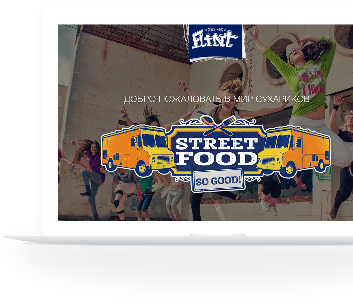
We faced a challenging task – to develop the site design for the new product from TM Flint – croutons with new StreetFood flavors.
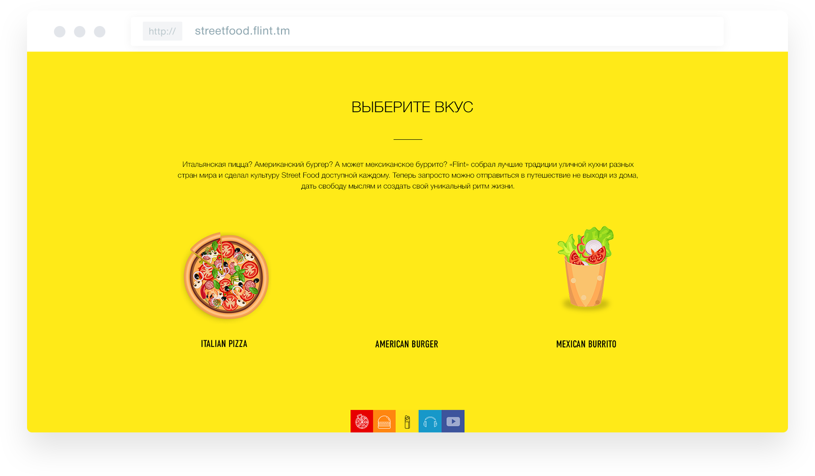
The “all on one screen” approach was chosen as the concept’s basis. From the first step, all Flint flavors are revealed to the guest, needing only to click on the menu at the bottom of the screen.
streetfood.flint.tm
02
Colors
In the color scheme of the site, we chose three colors – yellow, orange, and red. Such bright and juicy shades can stimulate appetite even if the feeling of hunger is not very pronounced
Colors
In the color scheme of the site, we chose three colors – yellow, orange, and red. Such bright and juicy shades can stimulate appetite even if the feeling of hunger is not very pronounced


03
Flavor selection
Unusual animation adds dynamics, interactivity, and responsiveness to the site. It helps attract the user’s attention and focus it on the necessary things.
Flavor selection
Unusual animation adds dynamics, interactivity, and responsiveness to the site. It helps attract the user’s attention and focus it on the necessary things.
04
Typography
Typography


05
Icons
Icons
06
Remaining screens
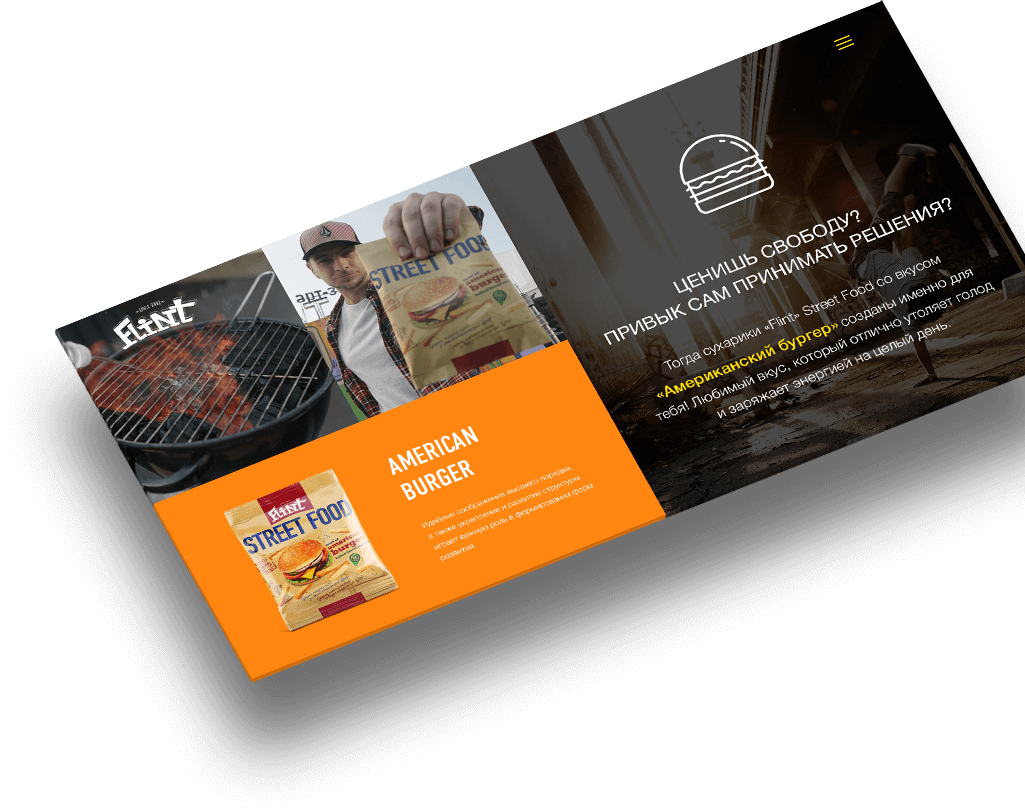
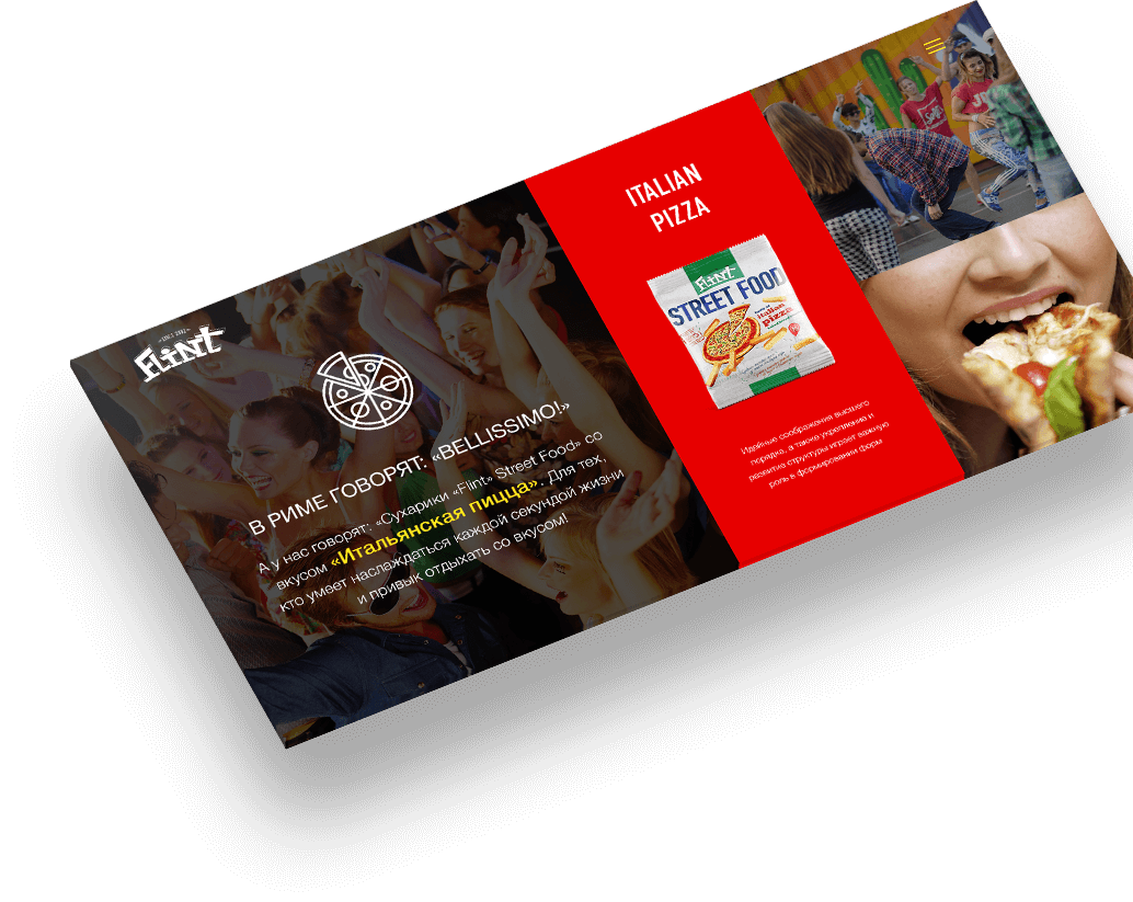
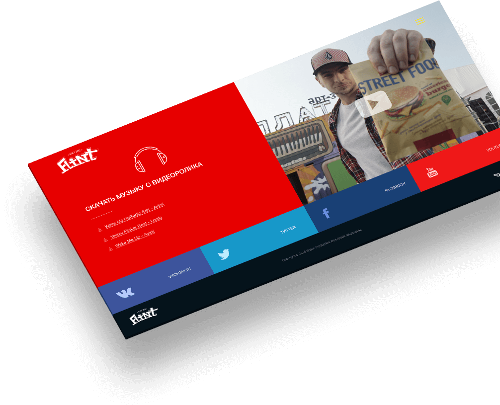
This site incorporates advanced design techniques. These include flat design, a convenient structure, sans-serif font, and the use of responsive layout. The color schemes are chosen to maximally stimulate the taste receptors of potential customers.
Remaining screens
This site incorporates advanced design techniques. These include flat design, a convenient structure, sans-serif font, and the use of responsive layout. The color schemes are chosen to maximally stimulate the taste receptors of potential customers.




Mobile version
The mobile version has simplified navigation. To make it easier to understand, blocks present in the desktop version have been removed.
The mobile version has simplified navigation. To make it easier to understand, blocks present in the desktop version have been removed.
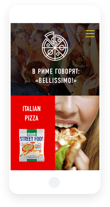
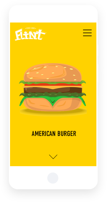

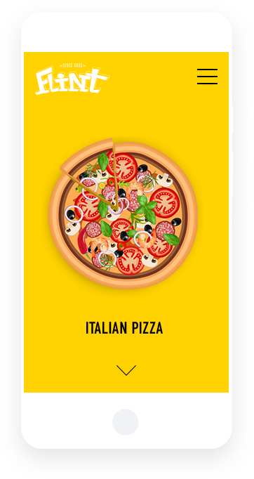

Everything users need is on one page, and there’s no need to navigate through a complex site structure to find the necessary information. As a result, we created a light, beautiful, and vibrant site where everything is simple and clear.


